An inhouse design system for building enterprise applications
RUDE
Design System • Enterprise • Web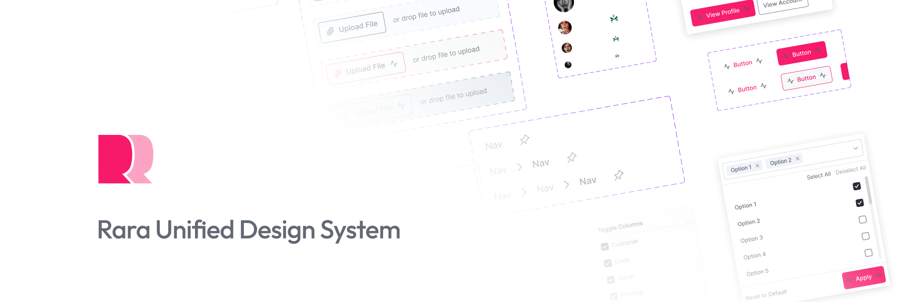
My Role
Product Scope
My Work Timeline
2022
Link to Website / App
https://design.raralabs.liveOverview
RUDE (Rara Universal Design) was the foundational design-elements library that preceded Mobius, establishing the first shared design language across Rara Labs products. It includes the design tokens, typography, core components and standardised protocols.
Context
Rara Labs builds enterprise software with hundreds of screens across multiple products, where consistency and speed matter more than one-off polish.
Before any of that could scale, the team needed a single shared vocabulary for design. RUDE — Rara Universal Design System is a version-controlled foundational design system that defined the core elements every product could be assembled from, replacing scattered, per-project styling with one source of truth.
It set the initial design language that could be branded and styled for different products. It kept the source of components the same, with new updates flowing to all products.
My Role
I initiated, led, and supervised the entire RUDE project as the Design System Lead, directing the definition and documentation of its foundational elements. This includes the design tokens, typography, design patterns and core components that the rest of the system would build on. Anjil would later take the design system to a new level by designing and creating components based on the foundations along with other developers. While backend developers and frontend developers would create a standard variable naming convention and API-standard for components.
What RUDE Established
RUDE laid the groundwork across three layers that still structure the design system:
- Foundations — the design tokens and primitives: color, typography, spacing, shadow and elevation, codified so they could be themed and reused rather than redrawn each time.
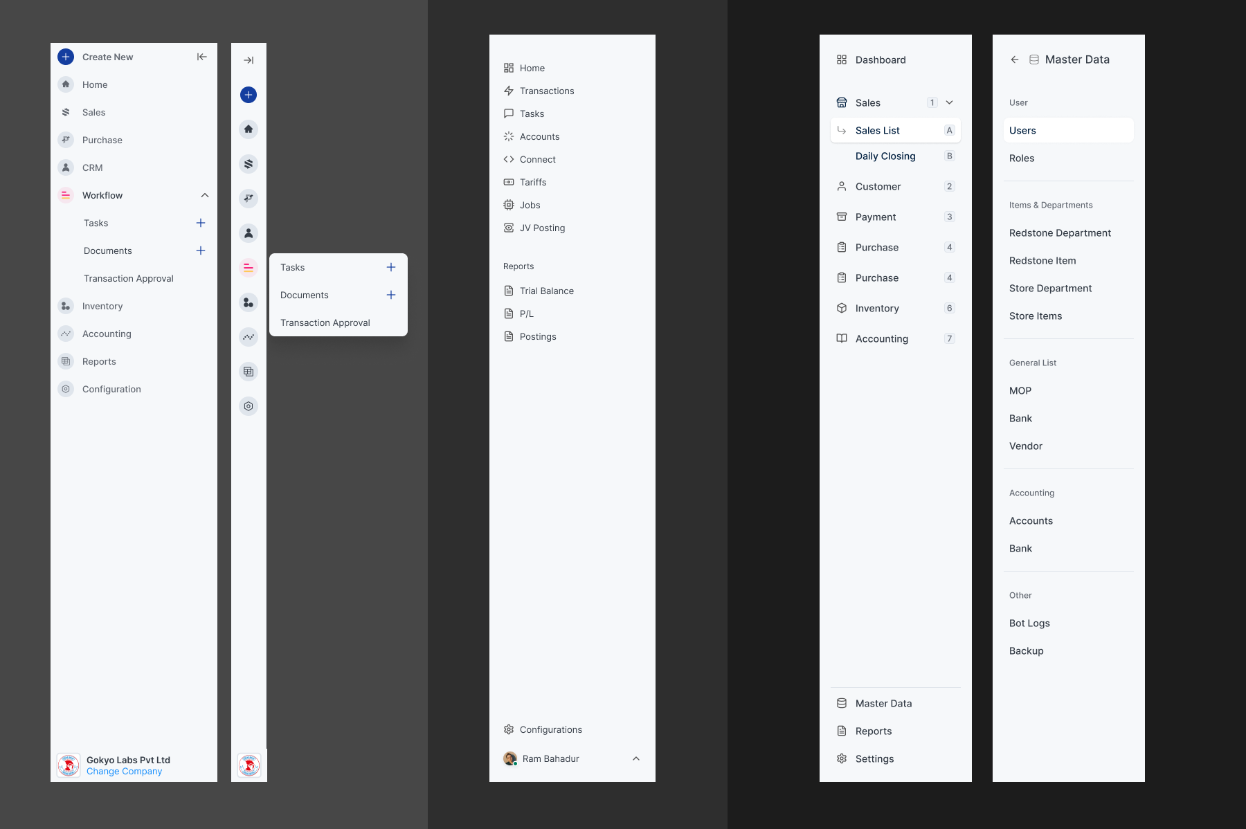
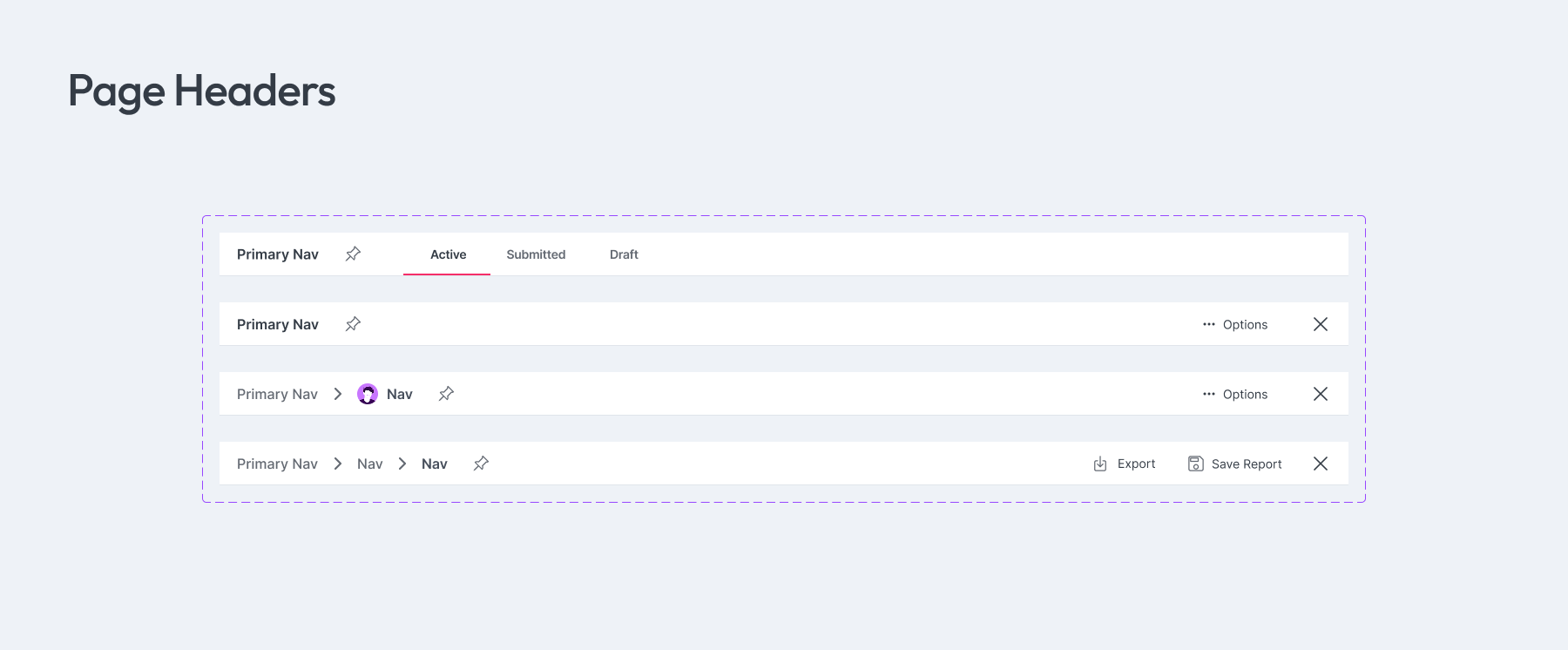
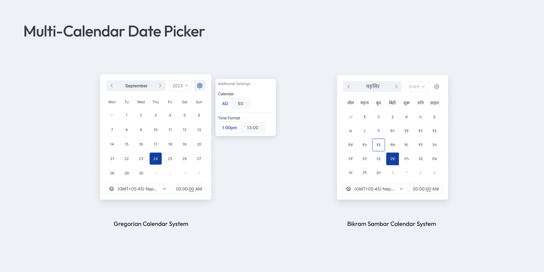
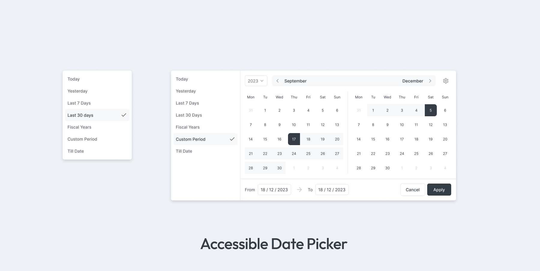
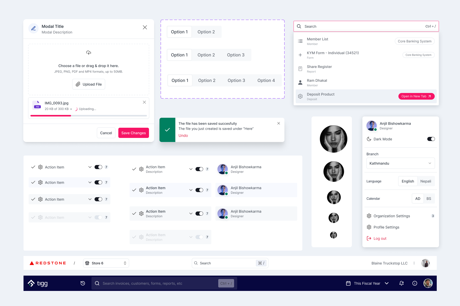
- Components — the reusable building blocks for assembling products, each with defined types, variants, styles and sizes (buttons, inputs, selects, modals, tables, and more).
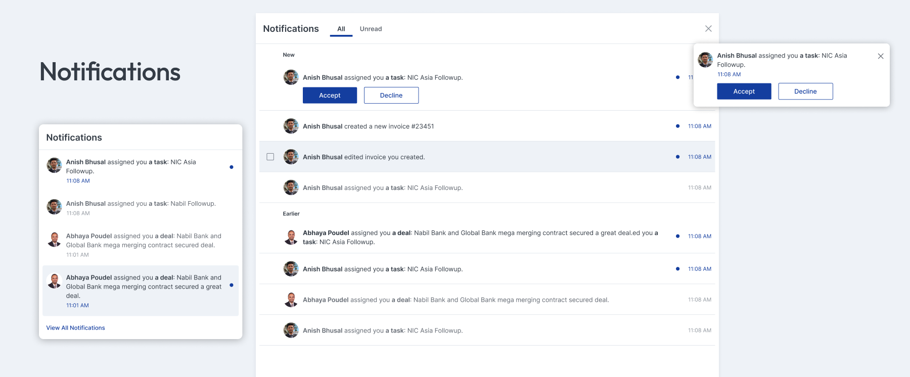
- Patterns — recurring product flows built from those components, such as authentication, forms, notifications and error pages.
- Protocols — standardised protocols for communication between frontend components and backend APIs.
The goal throughout was consistency, efficiency and excellence letting designers, frontend developers and backend developers build new screens from a tested foundation instead of starting from scratch.
Legacy
Tigg Design System was the origin point. Its foundations were carried forward into Mobius, the mobile design system, and the work lives on in the current Rara Unified Design System available as Figma libraries with auto-layout, variants and design tokens, plus React/NPM packages so frontend developers can drop in themeable, ready-to-use components.